Most people browse websites these days to gather information for work or entertainment purposes. If you frequent many websites in a day, you might have seen various third-party advertisements on a website. It is what pay-per-click advertising is all about, and it is an effective way to attract traffic to the website. Creating a banner advertisement to broadcast your business and website is one of the best advertising methods. Thus, this article will talk about banners, and give you ten proven banner advertisement design tips to get more clicks.
Importance of Ad Banners
Online advertisement plays a vital role in promoting your business. Thus, you must ensure that your ads look nice and fetch higher traffic. By designing banners for a client, you get paid for the clicks generated. It also gives the company higher visibility to the targeted customers.
Moreover, ad banners are quite an affordable option to promote your business. They do not cost much to design or display. With banner ads, you can quickly analyze your company’s number of clicks and views, thereby understanding the amount of traffic. You can also create a free logo design and add it to your banner for more visibility.
Tips to Enhance Ad Banner Designs
Through good banner design services, you can enhance your click rate. The following are some of the tips to improve Ad banner designs.
- Use Standard Banner Sizes
Banner ads are third-party advertisements, meaning you will publish them on other companies websites. To make things easy, try to use a standard banner size which most websites use. It helps to optimize the design and use it on various websites. It will also increase the chances of your banner advertisement design being accepted into popular websites.
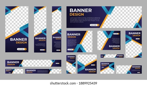
The commonly used sizes for banners include 336 x 280 px for a large rectangle and 300 x 250 px for a medium rectangle. Leaderboards are generally maintained at 728 x 90 px.
- Focus on the Logo and CTA
To create an appropriate banner, it must have the necessary components, which include the logo, CTA, or call to action button, and the ad copy. When you are creating a banner, you must keep your logo prominent. For this, you can use free logo design software.
Also, ensure that all the versions of your logo are consistent with the brand design. Make sure that the promotion is highlighted and the CTA button is prominent. You need to consider thumbnails and calculate the number of pixels to make your banner clearly visible across a range of platforms.
It is also essential to ensure that you use quality images and graphics. Graphics and photos related to your business enhance the user message as it is directly related to the product. Moreover, if you have the budget, you can hire professional photographers and models who can create custom photographs for you. Though it is not mandatory to use pictures, if you are using them, make sure they are high-quality.
- Take Special Care of the Ratio Rule
The ratio rule for developing a design for a banner is that around 80% should comprise images and visuals, and the other 20% should include text. It is especially applicable if you run target advertisements on platforms like Instagram or Facebook. These platforms do not accept or display ads that do not follow this ratio.
- Make the Text Engaging
The attention span for most users is only two seconds. Thus the text you put in your banner must excite the reader. It is also essential that you do not clutter your banner design with a lot of tests. Additionally, try to put a maximum of one header and make the text concise.
- Choose a Good Color Palette
Colors are essential in creating a professional look for your banner. Moreover, certain color combinations instill specific emotions in the viewer. The color white shows simplicity, purity, and grace, whereas shades of gray and blue are used with technological and advanced products. Pink, on the other hand, shows youth and love, whereas black shows formality, exclusivity, and luxury.
When you design your banner, it is vital that the color clearly resonates with your brand. If you are hiring professional banner advertisement design services, try to share the company’s colors with them so they can create effective banners.
- Ensure Appropriate Button Placement and Usage
Most users would want to know what they are supposed to do with the information while reading an advertisement. The advertiser should redirect them to the correct page. Also, ensure that you use a clickable button in your ads and that it is designed with accessibility in mind.
Generally, most brands keep their buttons at the bottom of the banner. Try to choose the correct button size. Do not try to make it maximize or minimized. Make sure the users can click on it with ease on a touchscreen and ensure that bright colors are used. The text on the button should be simple, easily readable, and direct.
- Work on Developing Animated Banner Ads
Today most brands are using animated banner ads, which have yielded some great results. According to experts, animated banner ads perform better than traditional ads due to their attractive features. Ensure that these ads are not displayed for more than 15 seconds, and their loop frequency should be not more than three times. While creating banner ads, you must understand the file format. It includes GIF, PNG, and HTML5, which majorly depends on the type of software you use.
- Develop Landing Page Consistency
Banner advertisement, just like any other type of ad, requires an amount of consistency. Here, consistency mainly refers to the banner advertisement design. They should be recognizable and send direct traffic to your website containing all the requisite information.
The landing page plays a crucial role in turning your visitors into customers. Thus, it should be structured and descriptive, so visitors do not get confused and shoot away from your landing page.
You must convert your potential visitors into customers. Thus, try to ensure that the banner ads are well-designed and attract significant traffic.
- Create Simple Banner Ad Designs
If you make the banners challenging to read, it will affect your campaign for banner ads.
Visitors usually scan your ads for a brief period. Therefore, getting your point through in those few seconds is up to you. For this reason, you must keep your banner ads straightforward and clear. Instead of using a lot of text, you should try to use an appealing visual created with a free logo design software to convey your point. Thus it implies that simplicity and cleanliness are essential.
- Position Your Ad Perfectly
Since you now know most about how to create professional brand ads, you need to choose where you want to place the ads. Ensure that the website you wish to place an ad has a dedicated space close to the main content. It will immediately attract the user’s attention, thereby boosting traffic.
Summing Up
The above-listed points are a few of the essential tips for creating a promotional banner. However, you can research on your own and develop additional tactics. It takes a lot of effort and patience to create a well-performing advertisement. Specific forms of banner advertisement design would require a more extended period, whereas some may require a shorter period. You can also hire a professional designer, as they have the right skill and expertise to create a proper banner advertisement for you.
More Details – https://www.odysseypedia.com/


